Overseas Landing Page
Kids Code Club
職 | UX Design Intern
時 | April 2023 - August 2023
所 | Fukuoka, Japan (Remote)
Overview
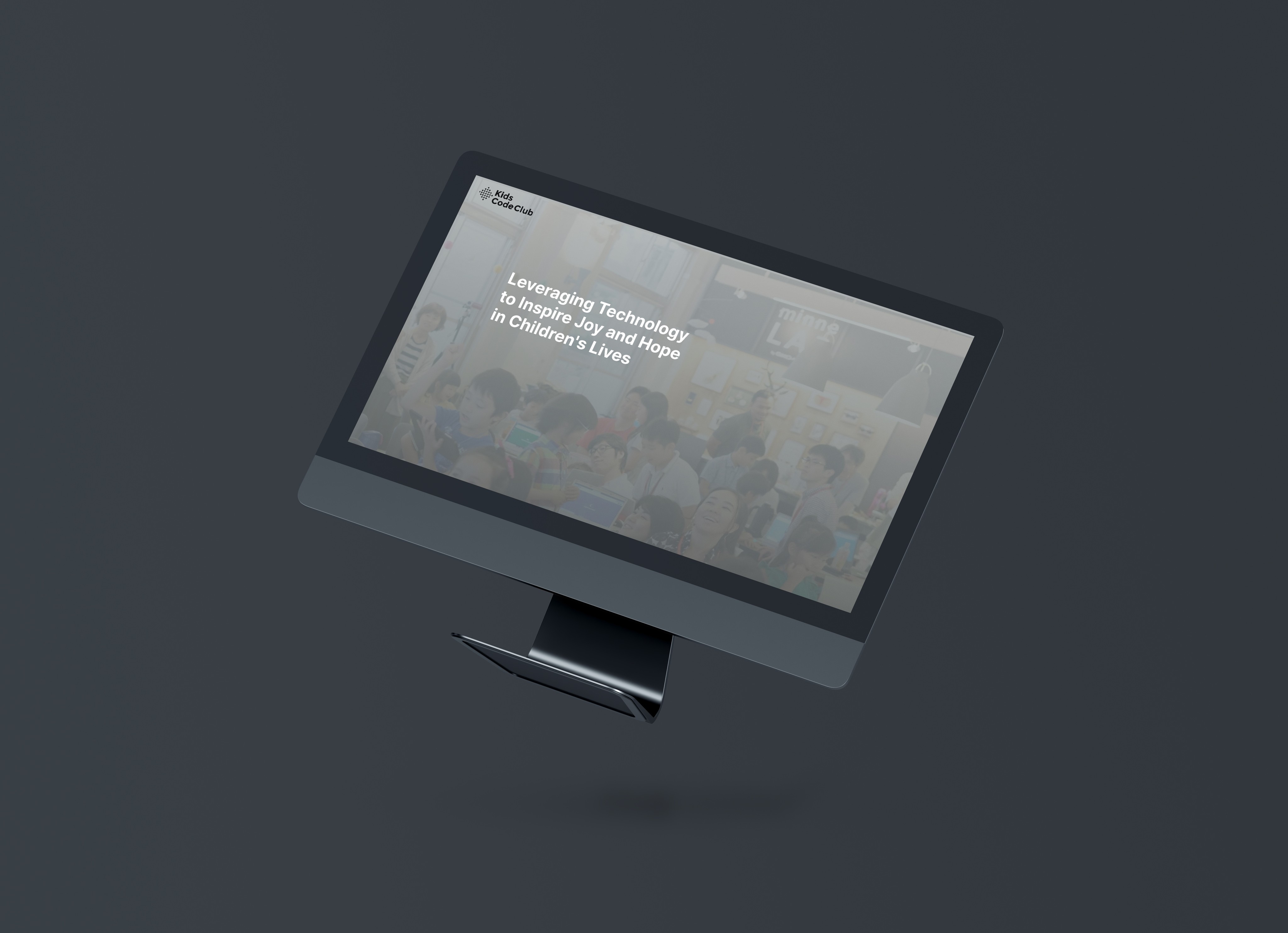
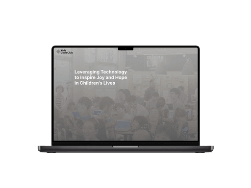
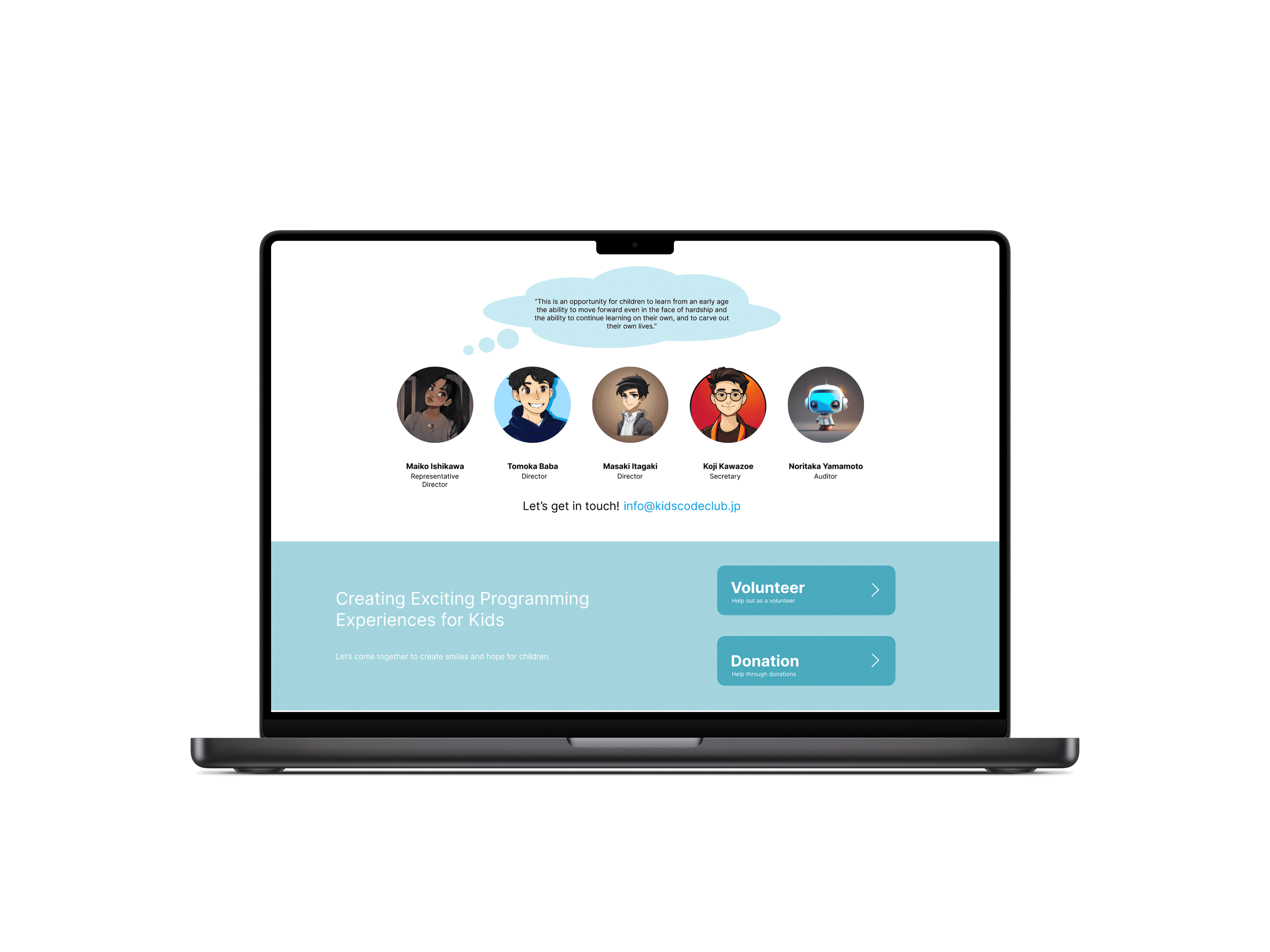
Investors overseas want to get in on KidsCodeClub but don’t know what it is because of the language barrier. With only a Japanese landing page, this project was designed to help expand to the overseas audience by creating a landing page with information about this non-profit organization.
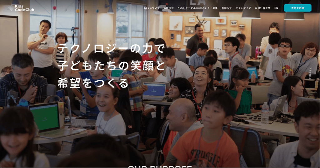
Studying the original website used in Japan, I replicated the website to keep the key components while also understanding that the target audience has changed to investors rather than key users. KidsCodeClub, a non-profit organization that hosts events for kids to learn more about programming, this website is crucial for the organization to increase its funds.
—
Problem
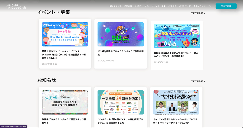
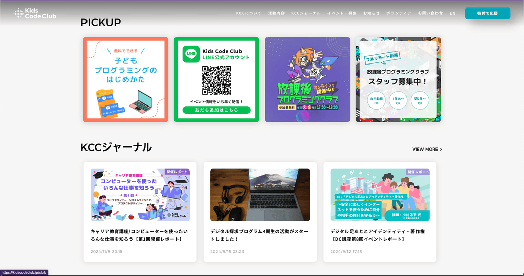
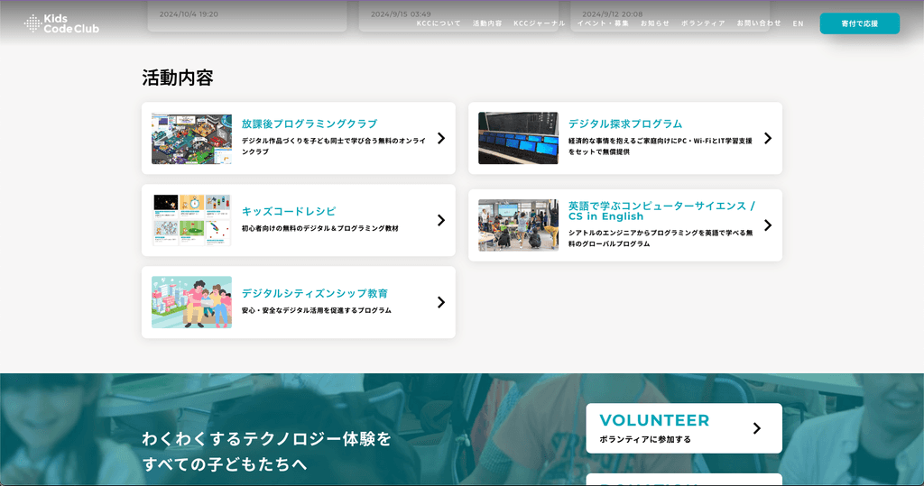
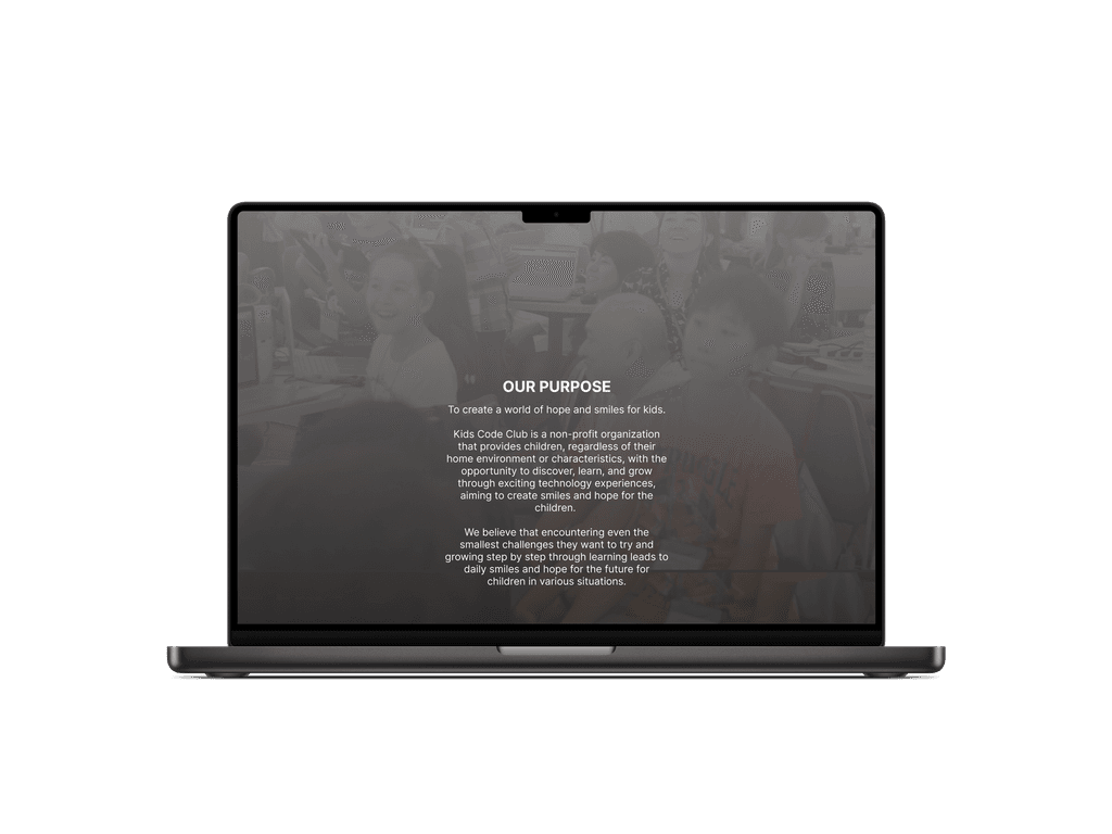
KidsCodeClub, a non-profit organization that aims to guide children with the opportunity to discover, learn, and grow through exciting technology experiences, aiming to create smiles and hope for the children. Through various events they host, many kids come to not just learn, but to practice their creative minds to create games, systems, and more in different formats (scratch, Minecraft, and more).
KidsCodeClub’s rapid growth and success has taken them to the next steps of outreaching to oversea investors. Currently based in Fukuoka Japan, this project was created to replicate, but also adapt to the oversea investors. With their current Japanese website as a reference, I spent time researching existing landing pages and studying the current website.
Solution
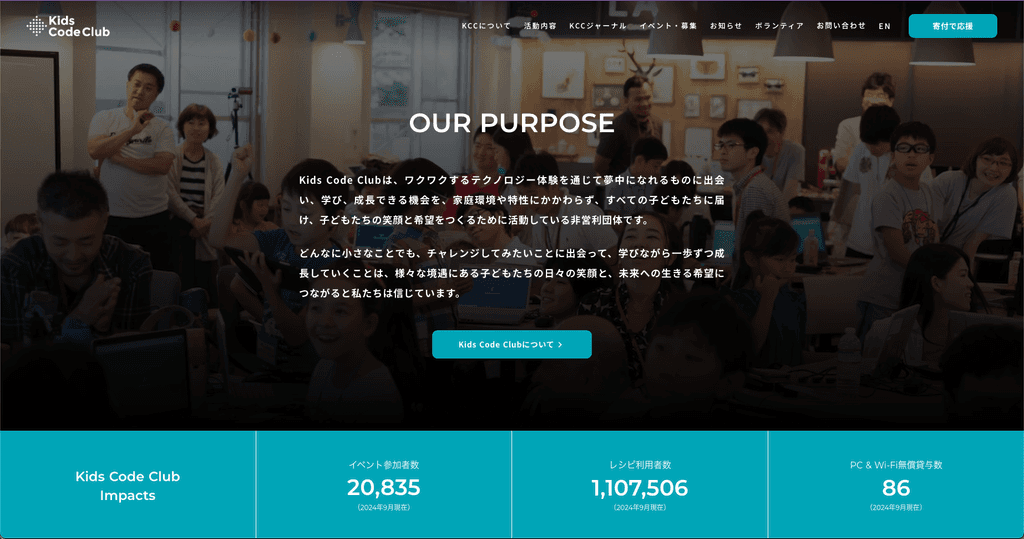
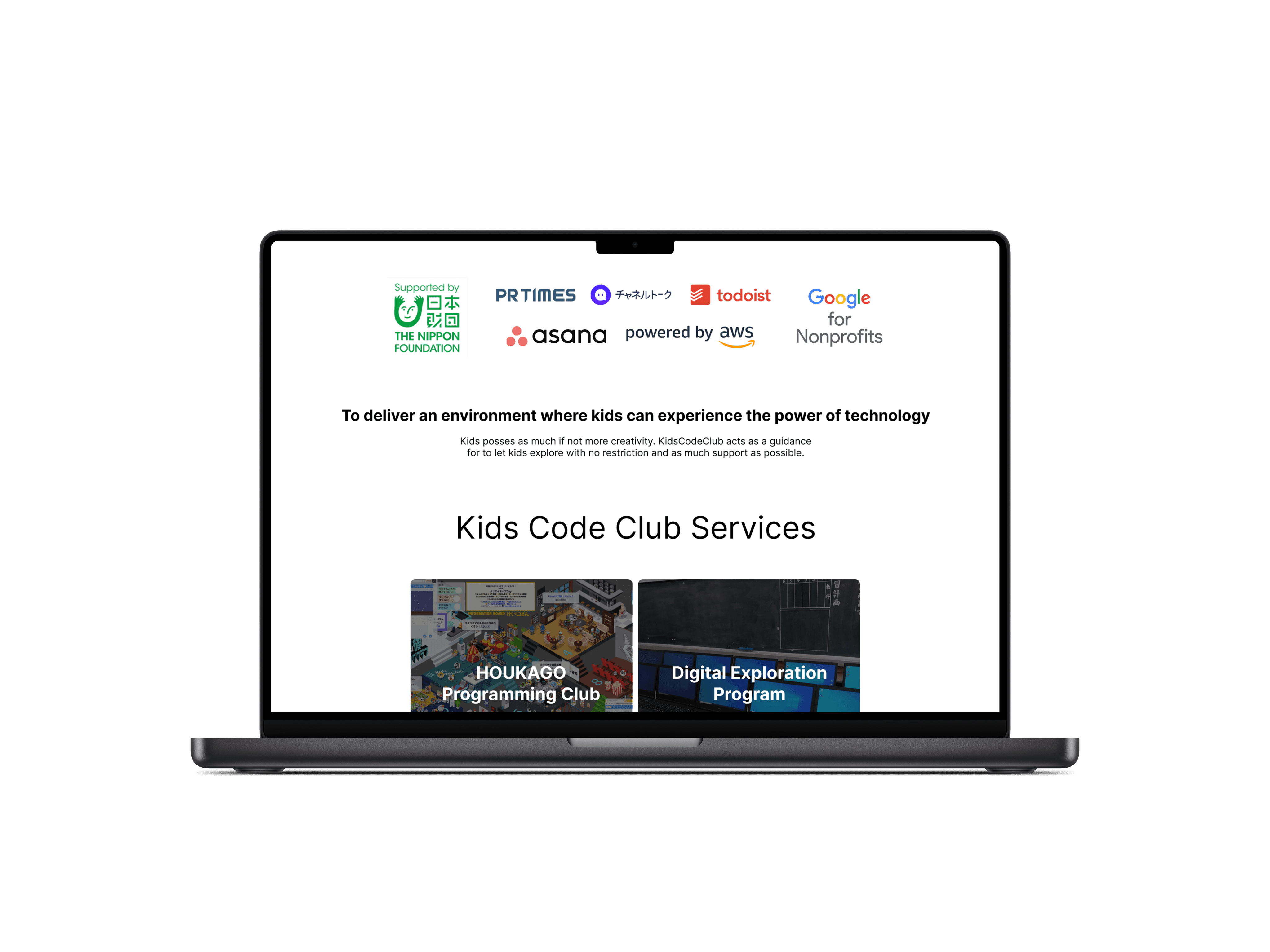
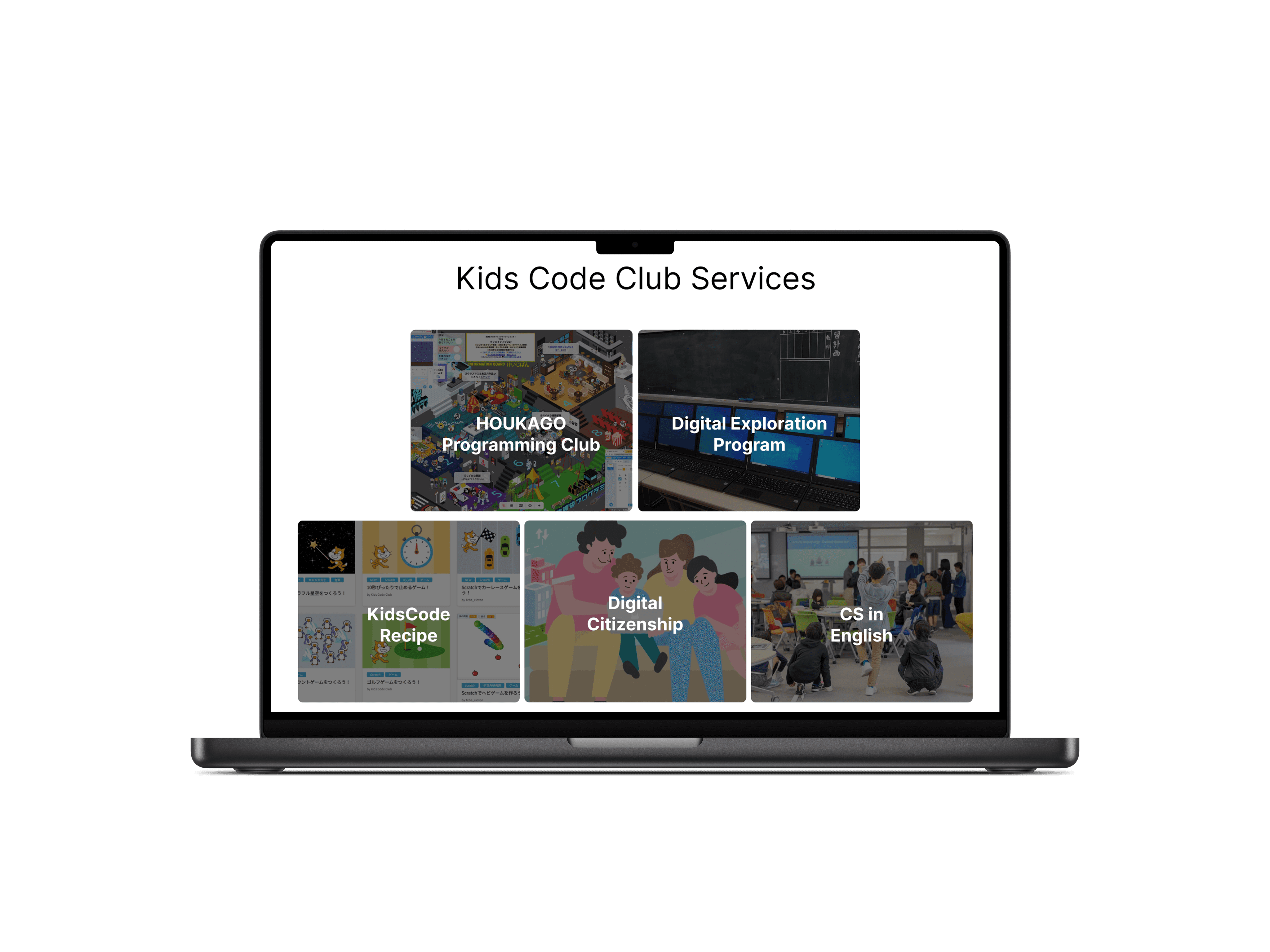
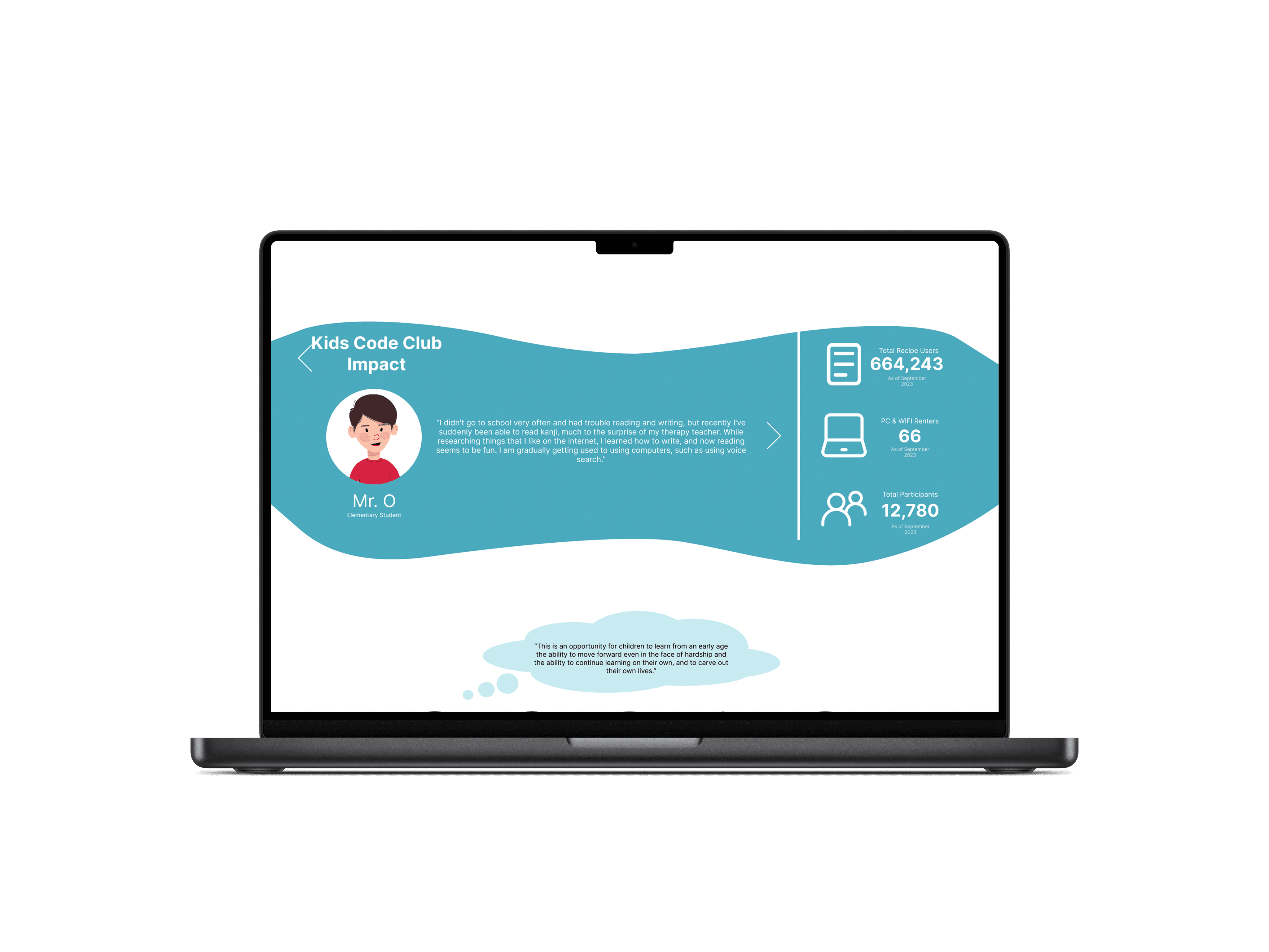
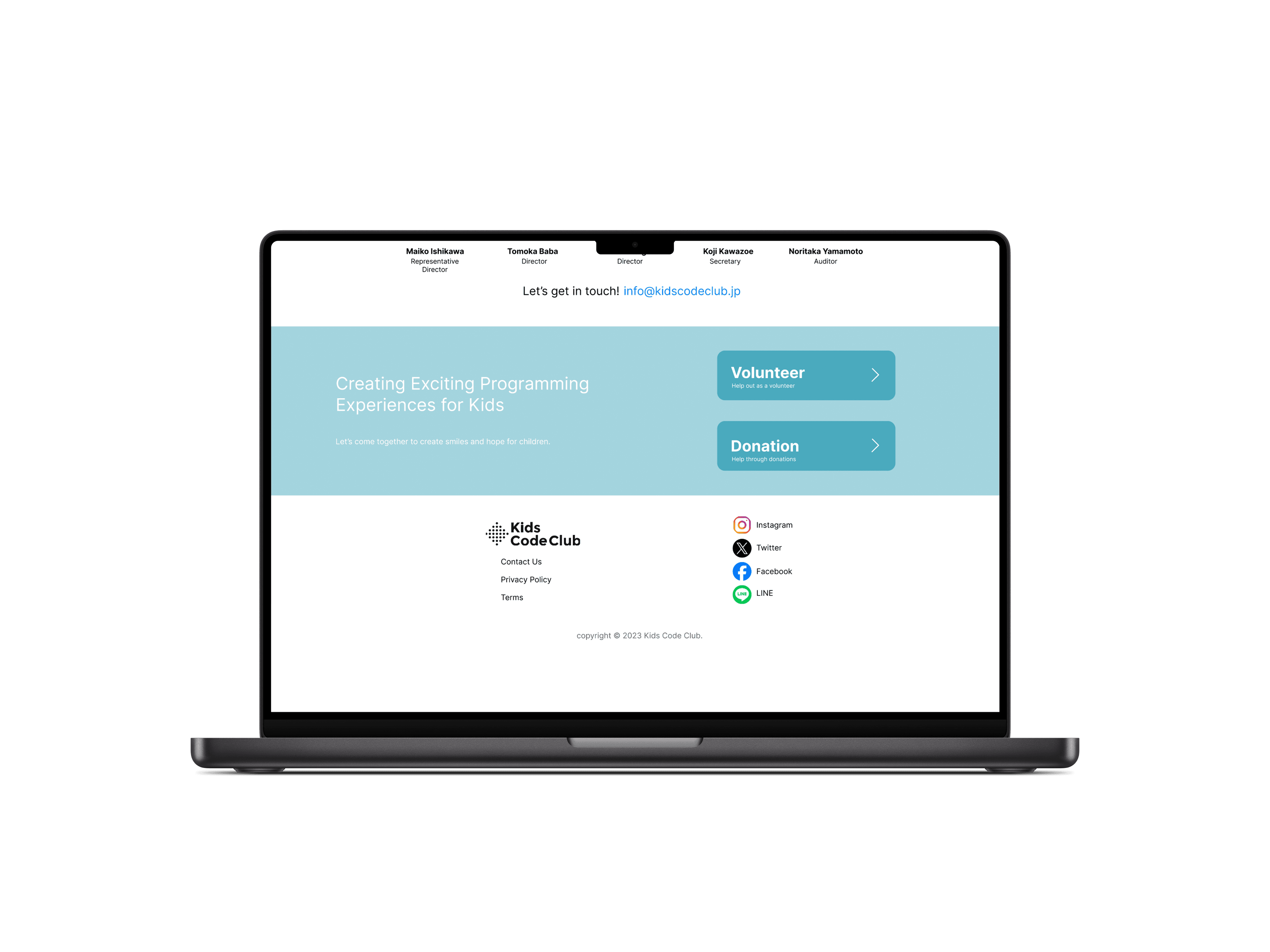
My solutions highlight all of the key components of the original Japanese website while adapting to a more Western interface design. Since the original website targets the users, which primarily are the children and their parents, the focus needed to change to target investors, specifically international investors. This solution allows overseas investors to easily and clearly understand who KCC is and what their values and goals are. With features displaying who KCC is, what they do, and showing what KCC’s primarily users feel about their services.
—
Design Process | Research
For this project, I began by researching existing landing pages, with the initial goal of creating a landing page for KCC aimed at attracting investors. I focused on landing pages from major companies like Spotify and Notion, which effectively highlight key features without overwhelming the page with content. I also explored Floop Edu's landing page, as it targets the education sector, and Branch Furniture's page, which targets a different demographic. By examining these varied landing pages, I was able to identify common success points and gain insights into how to design an effective, targeted landing page for KCC.
Design Process | Findings
From the research, I found that all of these websites start by showing the value of their services. Many showing this through a message, that was the first thing users would see. Another key finding was that each website kept their style and vibe through their designs.
Each design choice on each landing page, you could tell that it belonged to each company. And though each service provided many different feature, it was clear what their main features were as all of their landing pages focused on those features.
Design Process | Low Fidelity Wireframe
Once I finished researching, I started gather what the key features and services KidsCodeClub provided. Working with KidsCodeClub’s team, we discussed what were the key components they want investors to see in their websites. Along with other key value they want to highlight, I started to pull a part key features of their website. Focusing on keeping their style and vibe, I started to mock up a low fidelity website of what components would go where and how I would display them.
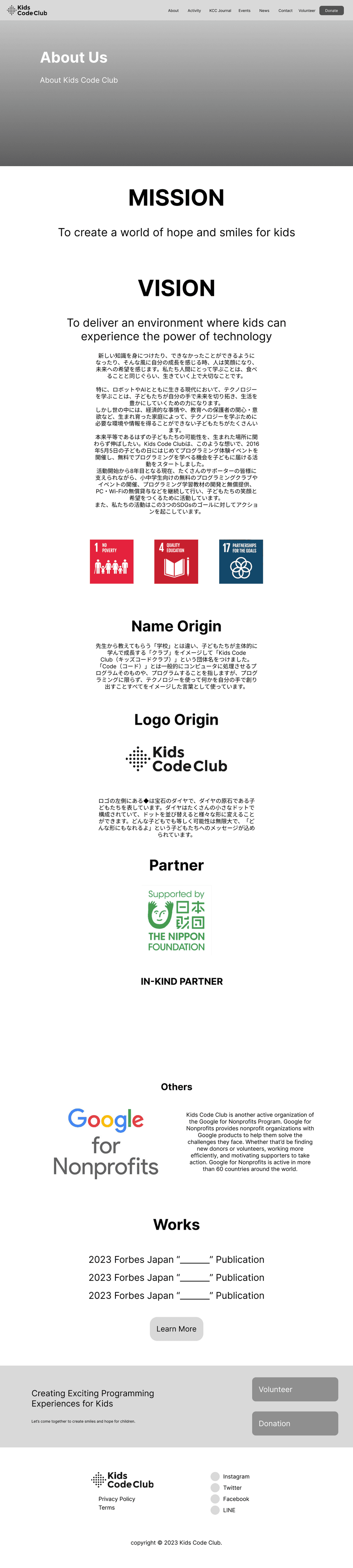
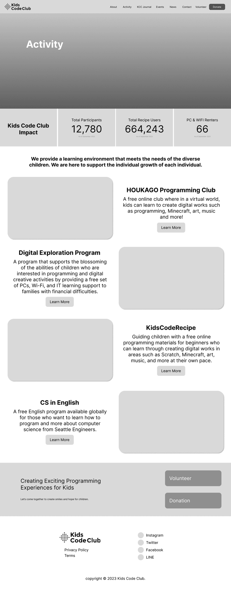
As the original Japanese website included a lot of services that were used by their target audience of children, I started by mimicking their original website. From there, I started to shave down, on what was important to KidsCodeClub as a company and what was important for investors to know to truly understand KidsCodeClub and its value.
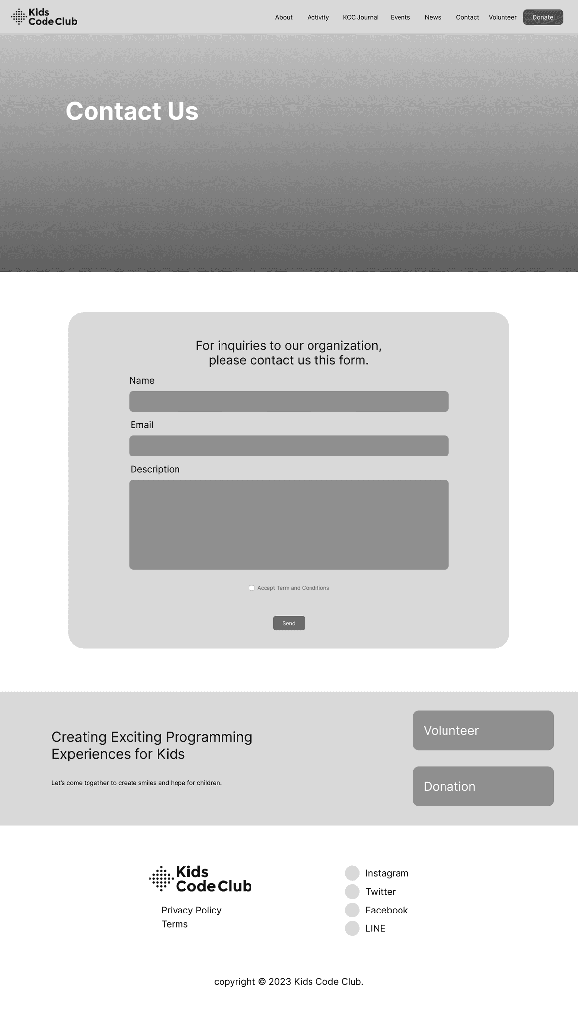

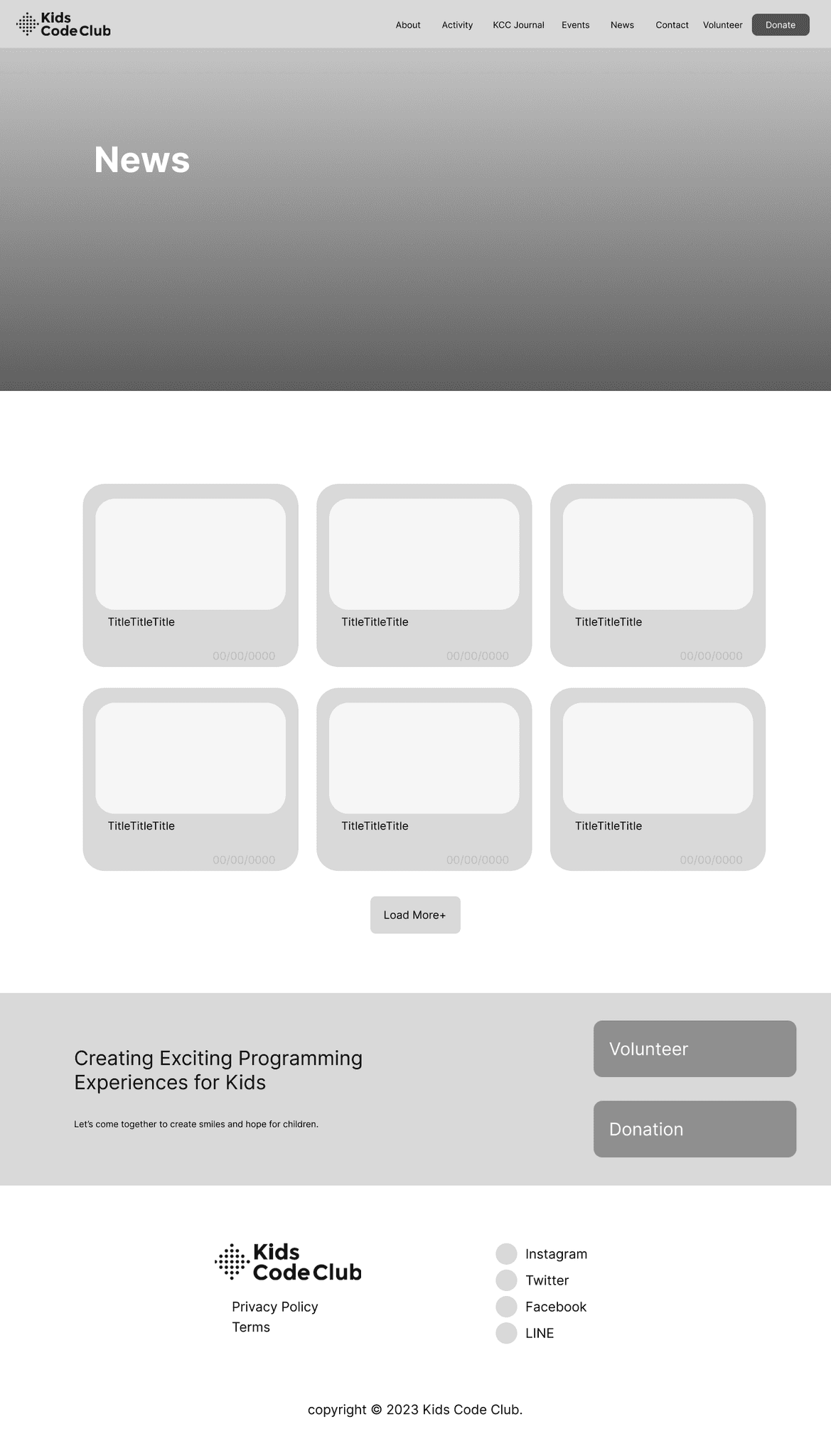
Design Process | High Fidelity Wireframe
After selecting the optimal layout for the website, I began adding content to the high-fidelity wireframe. As part of my internship role, I was responsible for translating the Japanese content into English, ensuring it conveyed the message accurately and appropriately, rather than relying on Google Translate. This allowed me to create a more effective wireframe. Throughout the process, I worked closely with the KidsCodeClub executive team, refining the design through multiple revisions to better align with their vision.
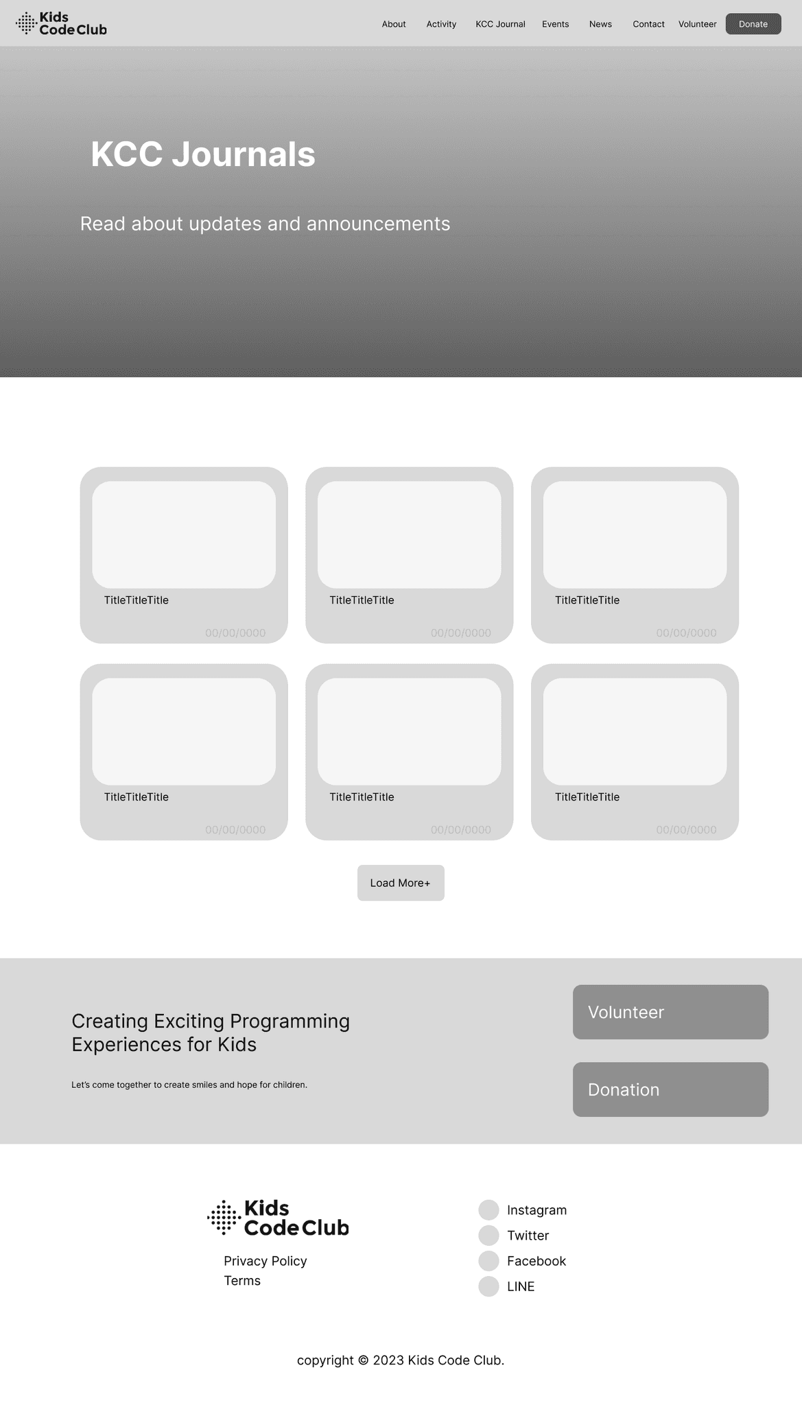
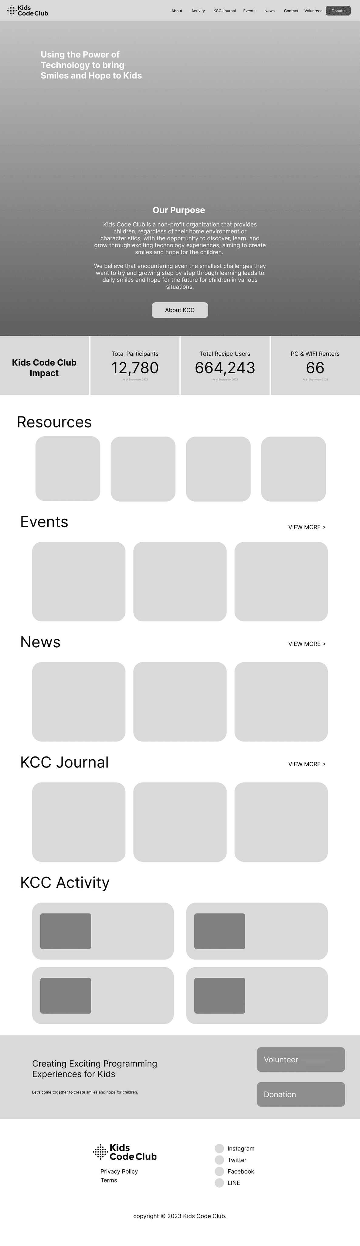
Multiple Page Tabs → Single page Landing Page
Strictly displaying KidsCodeClub services → Including User Feedback
Strictly displaying KidsCodeClub services → Including messages from the executive team and including sponsors
These revisions aimed to create a concise, simple landing page that conveyed the organization's passion and mission.
—
Reflection
During this internship, I gained valuable experience in the user experience design process, from researching existing solutions to creating wireframes for a new website. A key takeaway was the importance of deeply understanding the target audience, especially when working with groups I wasn't familiar with, such as international investors. This involved learning what they look for and what the company wanted to convey. Initially, I approached the project quickly, but through revisions, I refined my designs to align with the company's vision and better meet the needs of the audience.